Linkage Chart
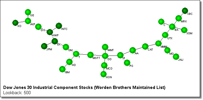
Checking the Linkage Chart box on the main form will cause a chart to be generated at the end of the scan that indicates which items in the list are most similar. Other charts are available via the data grid and also via this chart, but this one provides a good overall visual indication of how items are correlated with each other. It indicates correlation by drawing circles representing each item, then draws lines linking the best correlated items together. It allows you to quickly see which items are most like each other, and also those which are least alike. An example is shown below for the Dow Jones Industrial Components. You can quickly see that INTC and HWP are closely correlated for the period of this scan, while SBC and KO are not.

What is important in this chart is how items are linked along the lines. There is no relevance to how close the items are in the diagram except along the lines. So for example in the above diagram you can not draw anything from the fact that JPM and HWP are around the same distance as JPM and EK are from each other. What is important is to see that JPM and HWP are separated by EK, whereas JPM and EK are directly connected, so are more correlated. This method of displaying the correlated items was first described in the December 2000 issue of Technical Analysis of Stocks and Commodities magazine, in the section titled Market Topology. Our company has no relation to the authors of this article, and our implementation is different. However, we recommend reading the article for further information.
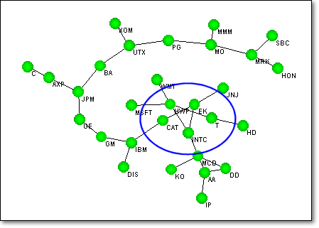
The chart creation is done using multivariate conjugate gradient optimization to rearrange the circles in an untangled easy-to-see form. There are two main issues to deal with in the chart drawing: Tangling and Speed. Even though the program attempts to avoid crossed lines, tangles do sometime appear, for example below. The program will generally untangle knots like this for small lists (<50 stocks), but for larger lists (>100) it often will not be able to untangle the circles completely.
The second issue is speed. Small lists will take a few minutes to complete, depending on your processor speed, but larger lists take much longer. At any time while the adjusting is going on, you can pause the adjusting, and move the circles manually. You do this by going to the Command menu on the chart, and selecting Pause Adjust, or pressing the F9 key. You can then click and drag the circles to untangle them and help the program along. We suggest you don't do this until the adjusting has cleared things up somewhat, because before then you probably wont be able to do much better than the program can. When you have finished the manual adjusting you can get the program to carry on its adjusting, by pressing the F9 key again. The chart can be resized by dragging the left or right sides. You can not resize it by dragging the top or bottom, because CorrelScan automatically sets the optimum aspect ratio for viewing, in other words if you select the width, it will select the height. If you want to process another list you can close the chart and go back to the initial form to select a new list. Until you close the chart, the button on the main form will read 'Stop'. When the chart is closed it will read 'Start' allowing you to run a new scan. If you click the 'Stop' button while the chart is open, the chart will be closed and the button will change to 'Start'.
Chart Settings
The various settings for the linkage chart are shown and described below.

|
|
Chart Type This allows you to select which items should be linked to each other. The standard method, as described above, is to link items that are most correlated - this is enabled when you select the 'Correlation' option. However, you can also choose to have items linked according to how anticorrelated they are - this helps you easily find items that behave opposite to each other so you can take opposite trades on them. In addition to correlation type charts, you can also link items by their risk adjusted return. This is useful in finding minimum volatility pairs - please review the section describing this method for more information. In Correlation mode the circles will be shown in green, in Anticorrelation mode in red and in Risk Adjusted Return mode in blue. To illustrate these options review the charts below (these are obtained by right-clicking on the line connecting items on the linkage chart and selecting Show Chart.) You will see that DD and MM move very similarly, while DIS and HPQ generally move in opposite directions (for this time period.) |
Next, look at the correlation and anticorrelation linkage charts below to see how these above pairs are placed. You can see that on the correlation chart that DD and MMM are shown directly linked, while on the anticorrelation tree, DIS and HPQ are directly linked. Note where the other items are located in each chart.
For the Risk Adjusted return option, review the two charts below, which show two different pairs where one item is short and the other long. The green curve shows the profit made from the long position and the red curve the profit made from the short position. The black curve shows the profit from the combined position. The top chart for the pair PFE-MO shows a good profit with low volatility, as shown by the relatively low noise of the black line. The bottom chart shows a less profitable and more volatile pair, PFE-AIG.
Below is shown the linkage chart created using Risk Adjusted Return as the linkage measure. You can see that PFE and MO are shown directly linked while PFE and AIG are relatively further apart. You can further see that many items are linked with MO, indicating that for this period it was one of the most profitable longs. Likewise, VZ can be seen as one of the most profitable shorts.
|
|
Line Color This setting is used to shade the lines connecting the items according to different measures. You can choose between (a) none - which is how the above charts are shown, (b) correlation, where darker lines indicate higher correlations, (c) Number of Standard Deviations of Difference (Stds Diff) between the items (for pairs trading), (d) The slope or angle of the deviation curve (Diff Angle) and (e) the Risk Adjusted Return (RAR). Option (c) is particularly useful in combination with the correlation type linkage chart. In this case the items are linked by the highest correlation, while the lines are colored by the greatest deviation - so the darkest lines are the best trading opportunities. The chart below shows these settings. You can clearly see that of the highest correlated items, the pair JPM-VZ is a good pairs trading opportunity. Looking at the pairs chart below that you can see this more clearly - going long VZ and short JPM could potentially be quite profitable (this chart is obtained by right-clicking on the line connecting items on the linkage chart and selecting Show Chart.) |
|
|
Sphere Coloring Similar to the line color described above, the sphere coloring option allows you to specify how the items on the chart should be colored. All the above charts have been generated with the none setting. Using the Price Change coloring will cause CorrelScan to color the circles according to how much the underlying stocks have changed in price. The highest increasing ones are colored yellow and the highest decreasing ones are colored red. In the example chart below, you can easily see that BA has risen the most over the period and that MRK has fallen the most. Because the most correlated items are linked to each other, you will notice how the coloring is similar in various regions of the chart. |
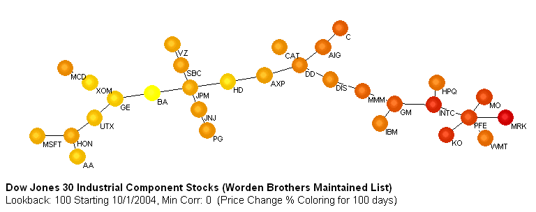
If you instead select the Trend Strength option then CorrelScan will determine which of the stocks in the list are trending up or down, or moving sideways. It will then color the stocks on the chart as yellow if they are trending up, orange if they are moving sideways and red if they are trending downwards. The chart above is reproduced below with trend coloring instead. The reason for the difference is that an item can be trending well, i.e., not deviating very much from a straight line, but not be going up or down very much. Likewise, a stock can be moving sideways and then spike up, so would have a large price change, but would not be considered to be trending well. Once the chart has been drawn you can flip between price change and trend coloring via the chart's Change menu.
Advanced Chart Settings
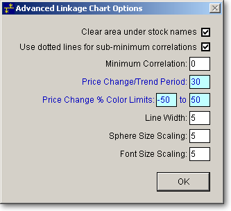
Various advanced or less-commonly changed chart settings are accessed by clicking the button marked Advanced in the linkage chart section. The settings are described below.
|
|
Clear area under stock names This is used to make the item names more visible on the chart. When checked, the area behind the text will first be cleared. On very complex charts this may obscure the linkage lines, so may need to be disabled. |
|
|
Use dotted lines for sub-minimum correlations will cause linkage lines that fall below the minimum specified correlation (see next setting) to be drawn dotted instead of solid. |
|
|
Minimum Correlation This value will be used to highlight less well-correlated items. The number is an absolute value so if you enter a value of 0.8, for example, then only correlations greater than or equal to 0.8 will be shown for correlation scans, and less than or equal to -0.8 for Anticorrelation scans. Items with correlations below 'Min Correlation' will still be displayed on the chart, but will be shown lighter and linked with dotted lines. An example is shown below. You can clearly see in this example that the correlation between NWAC and LUV is below the 0.8 minimum. |
|
|
Price Change/Trend Period is the time period over which CorrelScan should calculate the price change or trend of the items, for use in sphere coloring. |
|
|
Price Change % Color Limits This allows you to control the range of sphere coloring. For example if you want stocks whose price has fallen by 20% or more to be red and those whose price has risen by 10% or more to be yellow, then enter -20 and 10 in these boxes. Adjust these values as you like to get the tonal range that makes viewing the differences easy. Once the chart has been drawn you can adjust both the color range and period directly from the chart via the Change menu. |
|
|
Line Width / Sphere Size / Font Size Scaling These numbers allow you to adjust the relative size of the lines, spheres and font. You can also adjust these directly from the chart via the chart's Change menu (or via hot keys.) |
Miscellaneous Chart Features
|
|
Saving the Chart Picture This can be done via the Command menu or by pressing the F8 key. Saving the chart picture is different from saving the scan settings. Saving the chart picture only saves the graphic image of the chart not any of the settings. |
|
|
Zooming Once the chart is displayed, you can zoom into an area by pressing either the 'Z' or F7 keys, or by selecting 'Zoom In' from the View or Right-Click menus. The cursor will change into a crossbar, allowing you to click and drag over the portion of the chart you want to enlarge. To Zoom out press the 'Q' of Shift-F7 keys, or select 'Zoom Out' from the View or Right-Click menus. While zoomed in, you can move around the tree by pressing the SPACE bar. The position on the chart where the cursor is when the SPACE bar is pressed will be moved to the center of the chart. |
|
|
Pairs Charts These can be viewed by right-clicking the lines on the chart and selecting Show Chart. The Pairs Chart format can be switched (via its Options menu) between deviation mode, which shows more information for pairs trading, and non-deviation mode, which shows more information for minimum volatility pairs. The same chart is shown in the two formats below. |
|
|
Opening Item in TeleChart You can move your cursor over one of the spheres on the chart then right-click and select "Open Item in TeleChart" to open the chart for the item in TeleChart. |
|
|
Finding an Item When displaying a chart with many securities it may be difficult to locate an item you are interested in. Pressing the F5 key or selecting ' Find Item' from the View or Right-Click menus, will bring up a box asking you to enter the item to find. The item will then be highlighted in blue on the chart. |
|
|
Correlation Information Pressing the F6 key or selecting ' Item Information' from the View or Right-Click menus will allow you to list the items linked to the item you enter, along with their correlations and offsets. |
|
|
Redrawing Charts Clicking the 'Chart' button on the main form will use the data saved in the data files to redraw the chart. |
|
|
Changing Coloring and Minimum Correlation You can switch between trend and price change coloring for the chart using the Change menu. This menu also allows you to change the minimum correlation without rerunning the scan. |
|
|
Chart Caption When you move your cursor over the spheres on the chart, the chart caption will change to indicate information about the security. The security symbol and name is shown, followed by a list of the securities to which the item is most (or least) correlated, followed by the correlation coefficient and offset period (if this option is selected.) An example is shown below - you can see information shown for KO, Coca Cola Corp, which in this example is most highly correlated to HD, MO, INTC, etc. For the KO-HD pair, the correlation coefficient is 0.961, and the optimum offset period between them is -87 days, i.e., KO and HD are best correlated when KO is shifted backward in time by 87 days (In other words, HD predicts KO's behavior 87 days in advance. If the optimum offset was positive, then KO would be predicting HD.) |